


7
Bulfinch Press

6
Yale University

11
Little, Brown and Company

8
Shady Hill School
11
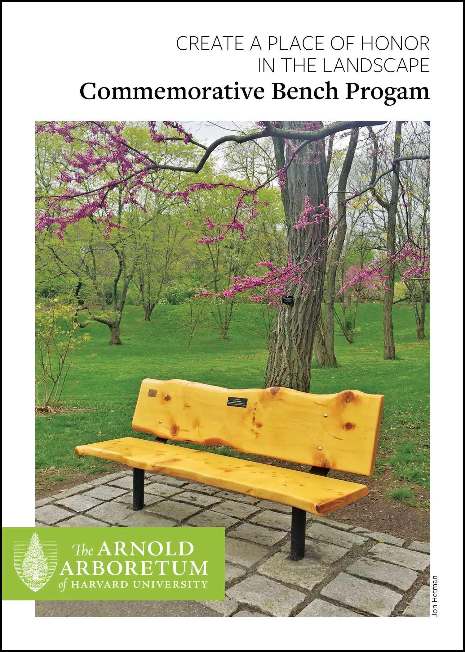
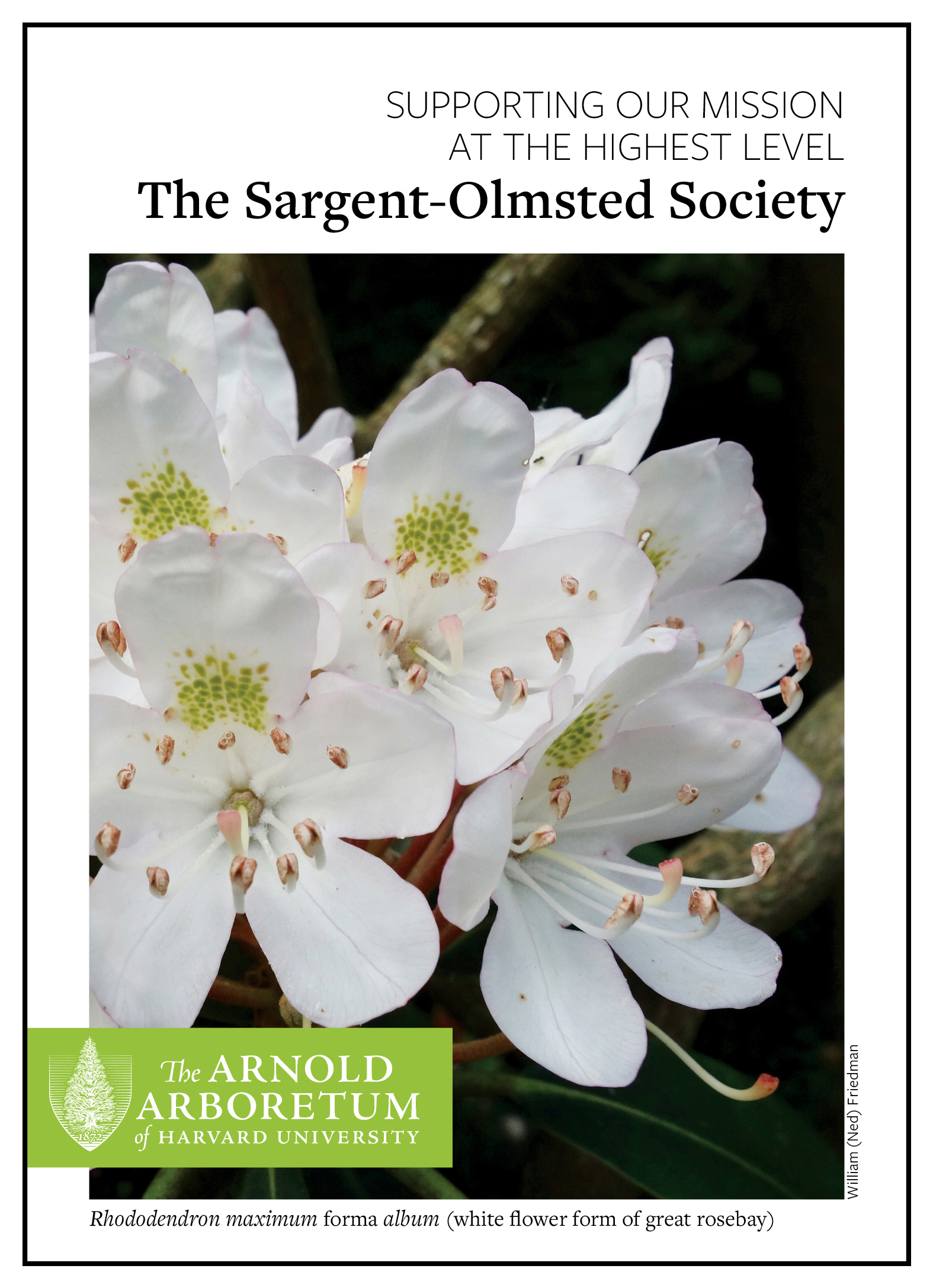
Harvard University Arnold Arboretum

8
Book Jackets

3
Shirley-Eustis House

23
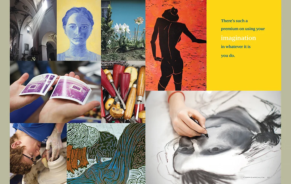
Commonwealth School

4
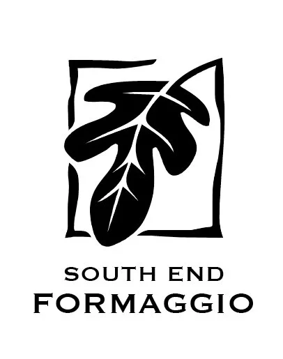
South End Formaggio

8
Arthur Morgan School

12
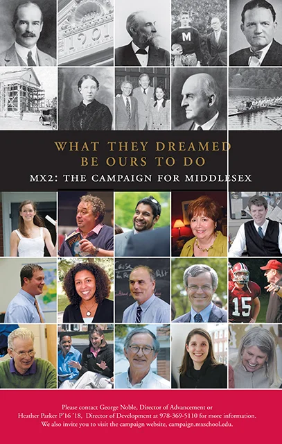
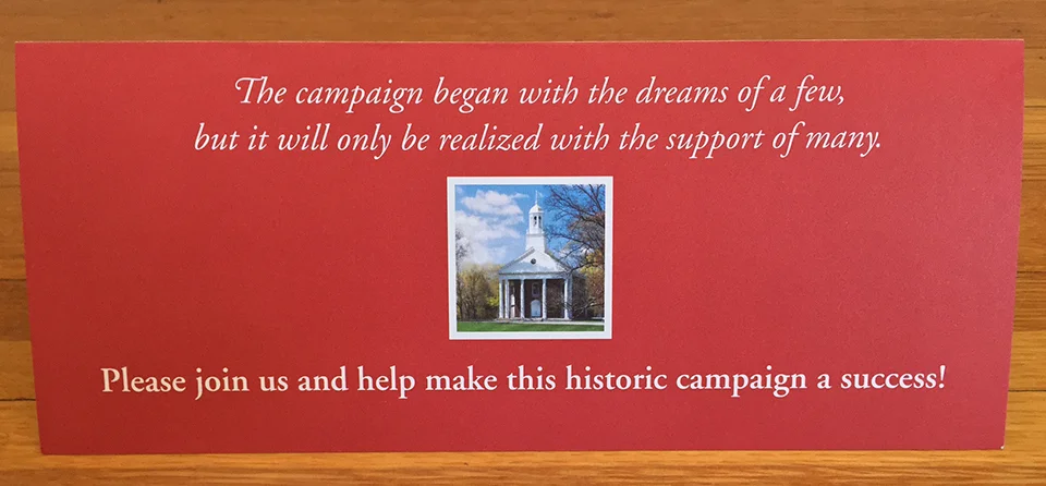
Middlesex School

6
The Photo Review

11
Tenacre School

10
Acanthus Press

19
Shore Country Day School

10
Groton School

8
Lynn Public Schools

10
Haverhill Public Schools

6
Invitations

7
Cambridge School of Weston

6
Phillips Andover

4
East Coast Grill
8
Logos

6
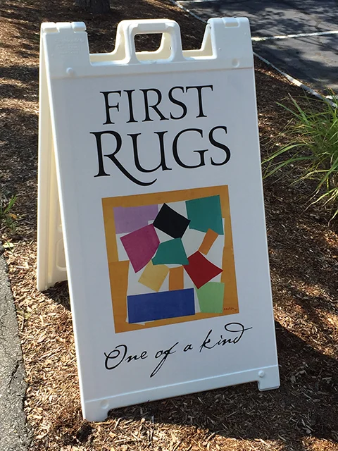
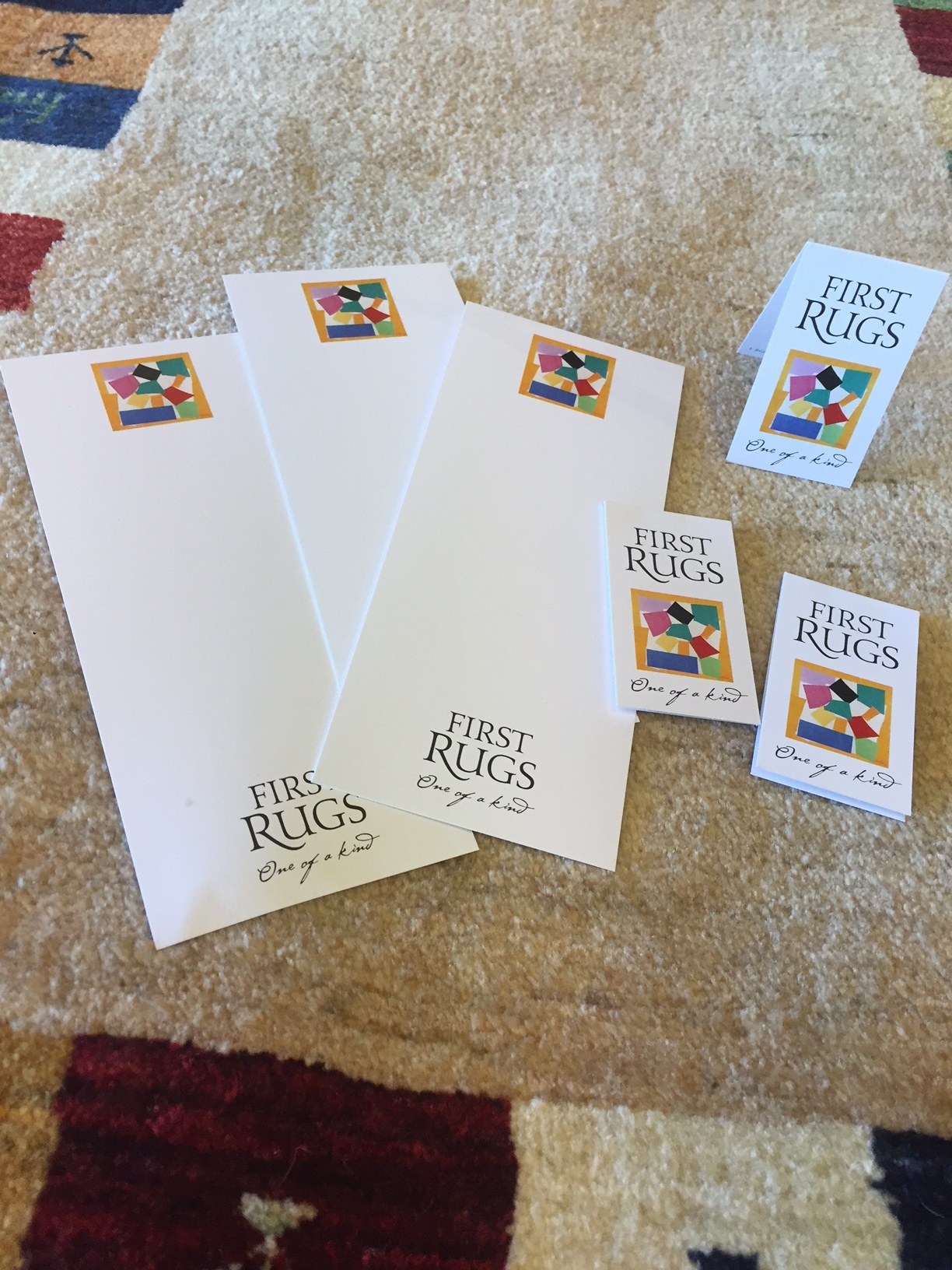
First Rugs

12
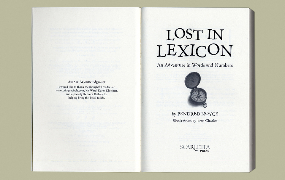
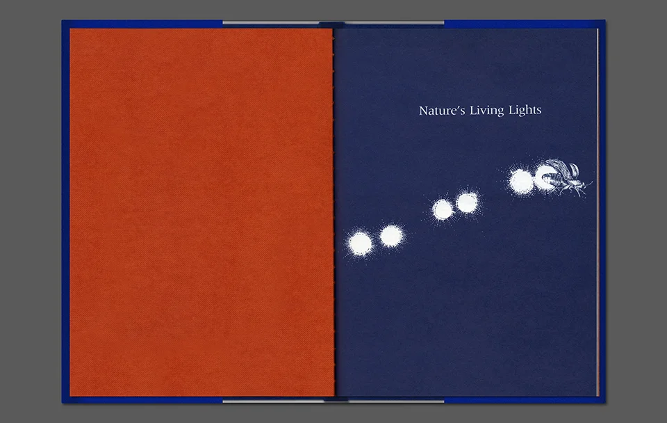
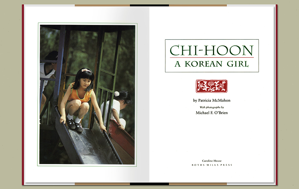
Children's Books
2
Institute for Recruitment of Teachers